How to give Mediterranean-inspired furniture a convincing direction
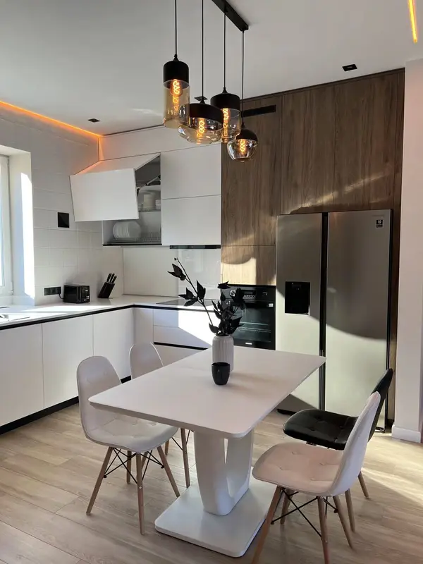
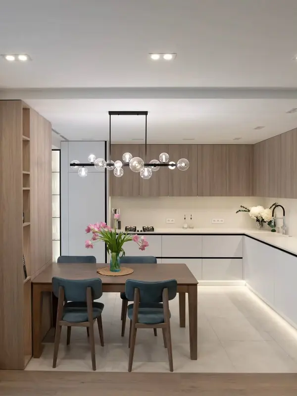
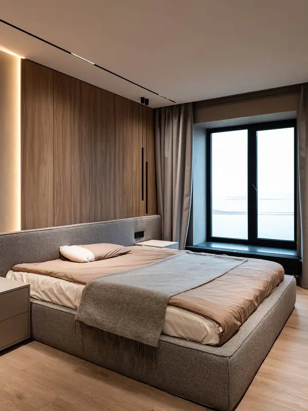
A Mediterranean interior can feel light and tactile without relying on a themed palette. Its useful qualities include soft mineral colours and natural timber.
A Mediterranean interior can feel light and tactile without relying on a themed palette.
The right decision connects appearance with construction and maintenance. For projects in Vinaròs, we also check the actual light, access and conditions in the room.
A Mediterranean interior can feel light and tactile without relying on a themed palette. Its useful qualities include soft mineral colours and natural timber.
We consider it for wardrobes, kitchens, living-room furniture and commercial work when its character supports the brief rather than leading it.
Copying a reference without reading the light and too many pale materials with no contrast should be discussed before drawings or samples are approved.
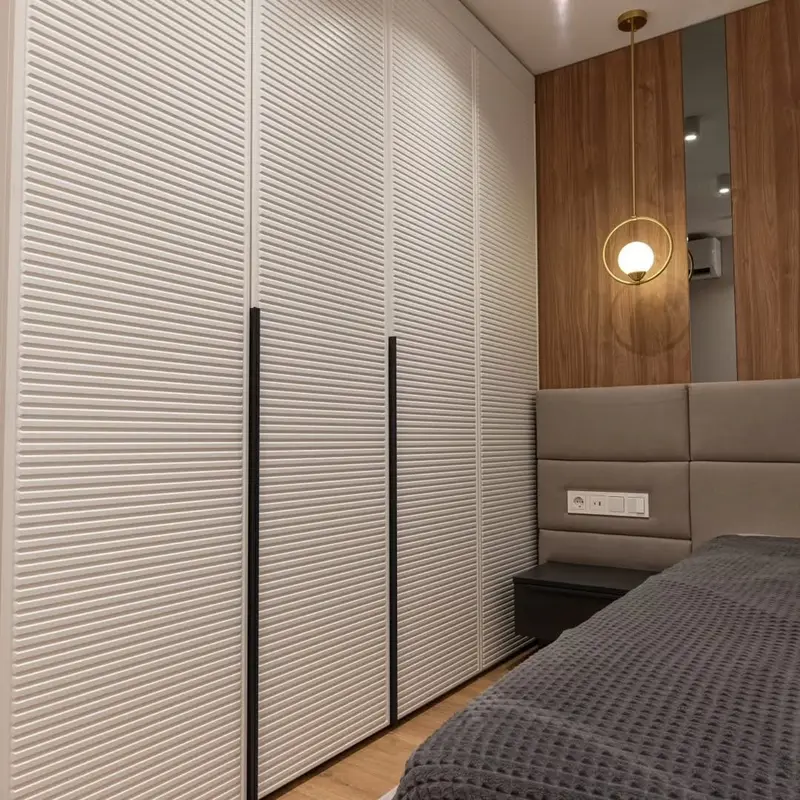
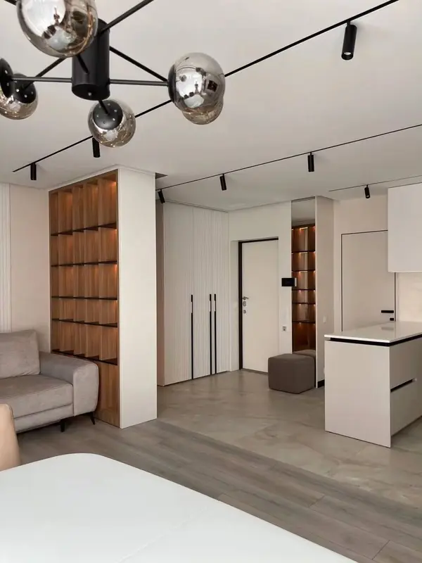
Woven or fluted detail used sparingly and space around the furniture can be balanced with simpler surfaces, so the finished room is coherent rather than overworked.
We compare realistic alternatives and explain what changes in construction, upkeep and price. You are not expected to specify Mediterranean-inspired furniture unaided.
Cleaning, light exposure, moving parts and local repair are considered so the choice still makes sense after years of use.
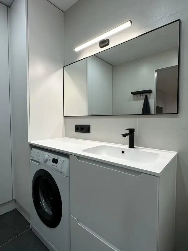
We do not begin with a catalogue code. The space and the job of the furniture determine where this approach is useful and where another solution would be more honest.
Existing floors, doors, wall colours and daylight set the context. Soft mineral colours may look very different beside warm stone, cool tiles or strong coastal light.
Natural timber can be the right focus, while less visible areas use a simpler material. This often improves both performance and budget control.
Edges, handles, shadow gaps, glass, lighting and adjacent panels are resolved with the material. A finish cannot be separated from the detail that contains it.
Variation, sheen and texture are discussed before production. If natural materials are involved, we also agree what degree of variation should be expected.
The point about copying a reference without reading the light is not a reason to reject the option, but it should shape where and how the approach is used.
People often arrive with a picture of mediterranean-inspired bespoke furniture and one very practical frustration. We separate the two. In Vinaròs, that may mean discussing practical storage before colour, because the route in can rule out an otherwise attractive construction.
Natural timber can give the scheme its identity. Used everywhere, it can also become tiring. We normally choose the few places where it has the strongest effect and let the rest of the composition settle down.
“Can it be done?” is only half the question. The other half is whether woven or fluted detail used sparingly will remain pleasant to use and reasonable to repair. Sometimes the simpler answer is the better-made answer.
A sample under showroom lighting is only a clue. Beside renovation interfaces in Vinaròs, its colour, edge and sheen can read quite differently. That is why the room remains the final visual reference.
Not every premium material earns its cost in every position. We reserve it for the surfaces and details where touch, light or repeated use will reveal the difference.
Practical storage and delivery routes through occupied buildings are considered while the piece is still being divided into workable parts. The aim is a calm fitting sequence, not an improvised solution in the hallway.
The address in Vinaròs adds useful context. We may be working with town apartments, family houses and homes close to the coast; the measured property then decides which of those considerations genuinely applies.
The point about practical storage is recorded with the survey. If it limits module size, the design is divided at structurally and visually sensible positions.
The room, not the catalogue, is the colour reference. We review coastal air before confirming timber tone, lacquer sheen or a strongly textured surface.
The specification also considers renovation interfaces. Where the work involves delivery routes through occupied buildings, dimensions and responsibilities are fixed before one part closes another in.
No. It depends on the use, room conditions, desired appearance and budget. We may recommend it only for selected faces or combine it with a more practical supporting material.
Its effect depends on grade, thickness, finish, cutting yield and workshop detail. We compare it against another suitable option on the same design.
Where colour, texture or sheen is important, a representative physical sample is the useful reference. Screens and showroom lighting can be misleading.
Sometimes, but position and construction matter. Moisture, heat, cleaning and edge exposure must be checked before we confirm the specification.
Con unas fotos, medidas aproximadas y una idea de uso podemos preparar una primera orientación antes de concertar la medición.